Slow & Steady — A Podcast by ARTILLERY
If your domain is your website’s address, and hosting is the foundation and utilities, then your design vision is the architectural style of the town.
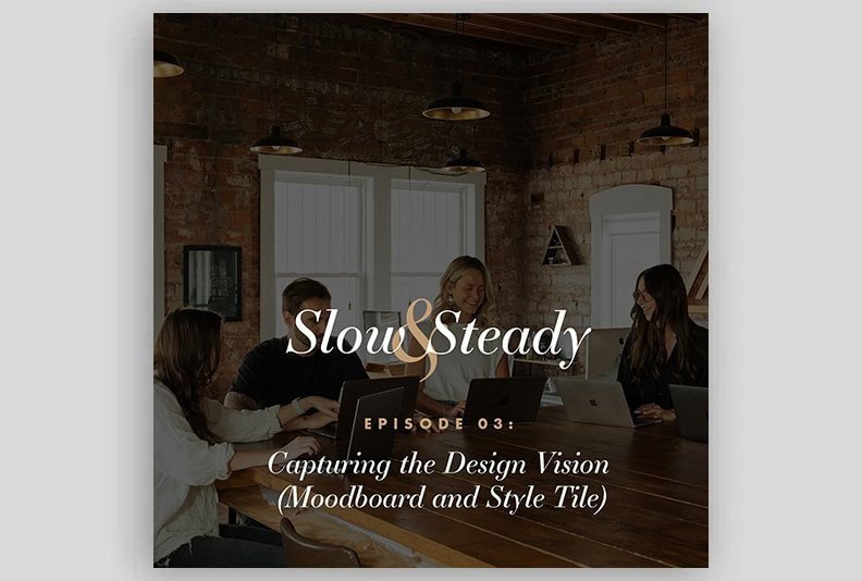
Is it clean and modern, like a new downtown development, or warm and eclectic like a historic main street? In Episode 3 of the Perfect Website series, Jake and John bring in ARTILLERY designer Sierra Beukelman to talk about how we actually capture that vibe before a single page is built.
Because if you skip this step and jump straight into mockups, you usually end up with revisions, confusion, and the dreaded “I don’t know, I just don’t like it.”
This episode is all about stopping that before it starts.
Episode at a Glance
Action step:
Give your designer 3 to 5 examples of websites or visuals you like, then focus your feedback on four things: color, typography, photography, and textures/patterns.
Main idea:
Moodboards and style tiles are where your website’s look and feel gets nailed down before any full page is designed.
Why it matters:
A clear design direction saves time, reduces revisions, and gives you confidence that “this looks like us” long before launch.
Big analogy:
Town → Address → Foundation →
Now: Architecture and vibe. Moodboards are “other cities you like,” style tiles are the materials board from your interior designer.
Quick tool:
Use inspiration folders by industry (construction, counseling, medical, church, etc.) to give yourself guardrails instead of staring at a blank Google Doc.
Listen & Subscribe
Slow & Steady — A Podcast by ARTILLERY
🎧 Listen here: https://artillerymedia.com/podcast/
Apple Podcasts: https://podcasts.apple.com/us/podcast/slow-steady-a-podcast-by-artillery/id1840249614
Spotify: https://open.spotify.com/show/37ZzVcI8N7xnEDqkap2vCW?si=70b138e65b8c42ca
Highlights & Timestamps
00:00–01:10 — Welcome back and series recap
Domains were the address and then hosting was the foundation. Now we are talking about design aesthetics with ARTILLERY designer Sierra and how moodboards and style tiles set the direction.
01:10–04:30 — Website Dispatch: The Body Lab & Brite Counseling
Jake, John, and Sierra walk through two recent launches,
The Body Lab LNK → https://thebodylablnk.com/
Brite Counseling → https://britecounseling.com/
and how each client’s space, personality, and photos inspired the design direction.
04:30–10:30 — How we actually capture a “vibe”
Sierra shares how she uses the strategy questionnaire, client photos, and inspiration sites to pull together a moodboard that feels true to the client, not just “generic modern.”
10:30–14:30 — Sunshine, feelings pillows, and not-looking-like-a-hospital
Brite Counseling wanted the site to “feel like the sun is rising.” Sierra shows how color and photography can lift the mood without going chaotic or overly bright.
14:30–19:30 — Inside Our Arsenal: Photoshop, XD, Figma
John explains his journey from Fireworks to Photoshop to XD to Figma. Sierra talks about using Photoshop for style tiles and why she keeps templates handy for speed and consistency.
19:30–24:30 — Tools, shortcuts, and the “left hand” problem
The crew jokes about keyboard shortcuts, ambidextrous designers, and why John still does not love the pen tool. Figma’s strengths for prototypes and systematizing colors get a shoutout.
24:30–31:00 — Moodboards vs mood lists and why clients feel overwhelmed
Open-ended “find websites you like” overwhelms most clients. Sierra explains how ARTILLERY now uses curated example folders by industry to make the process easier.
31:00–37:30 — The power of guardrails and letting designers do their thing
Better options = better outcomes. The best design happens when the client trusts the designer and the process.
37:30–45:30 — Logos, photos, and the curse of the 1977 brand
What happens when branding feels outdated or photography is low quality? Sierra and John explain how to adjust, when to push back, and when to recommend a rebrand.
45:30–52:30 — Why we don’t use your real photos in the first mockup
Placeholder photography keeps the focus on layout, typography, and color. Later, it helps clients see whether their real photos match the vision.
52:30–57:30 — The tiki hut website and timelessness
John tells the story of a very literal “beachy” website — tiki roof navigation and all — and how even that client eventually moved toward a timeless style.
57:30–end — How to give helpful feedback and what’s coming next
Sierra explains the four things that matter most in a style tile. The team previews next week’s episode on wireframes, outlines, and page structure.
Capturing The Design Vision (Plain-English Guide)
Think of this episode as the moment you decide what kind of town you are building. Not the number of streets yet or the specifics — the mood of the town.
Moodboards: Looking at other “towns”
Historically, ARTILLERY asked clients to “send websites you like.”
Sometimes that worked great. Other times clients froze.
Now we use curated folders based on industries like:
- Construction
- Therapists & counselors
- Medical practices
- Churches
- Interior design & creatives
Each folder includes:
- Example sites we’ve built
- Additional inspiration sites chosen for the industry
- Light guardrails so clients know what to look for
This prevents overwhelm and eliminates the “I don’t know what I like” problem.
Style Tiles: The interior designer’s board for your brand
A style tile is the “materials board” for your website.
It includes:
1. Color palette
Pulled from:
- Logos
- Photos
- Materials (wood, brick, wallpaper)
- Overall vibe
2. Typography
Heading fonts, paragraph fonts, accent fonts.
3. Photography style
Bright and airy?
Moody and dramatic?
Candid or posed?
Lifestyle or studio?
4. Textures & patterns
Subtle grain
Lines
Shapes
Background elements
Anything that builds the tone
Sierra tells clients:
“Ignore layout for now. Just focus on colors, fonts, photos, and textures. That’s all we need at this stage.”
Case Study: The Body Lab & Brite Counseling
The Body Lab LNK
The owner had:
- A sleek, high-end studio
- A modern vibe
- Strong photos
Sierra used:
- Crisp typography
- Full-width images
- Minimal textures
- Neutral tones
The result: a site that feels like walking into The Body Lab.
Brite Counseling
The client told Sierra:
“I want the site to feel like sunlight.”
And she meant it.
Sierra leaned into:
- Yellow, but warm and comforting
- Pops of color inspired by the “feelings pillow”
- Clean typography
- Gentle gradients
The site feels joyful, hopeful, and human — exactly what the client wanted.
Visit the site: https://britecounseling.com
Inside Our Arsenal: Photoshop, XD, Figma (and Why Not Canva)
- Photoshop:
Sierra’s go-to for style tiles, fast and reliable with reusable templates. - Figma:
John’s primary mockup tool for:- Variables
- Clickable prototypes
- Side-by-side desktop/mobile layouts
- XD:
Used briefly, now fading out. - Canva:
Amazing for social posts, flyers, and quick templates.
Not ideal for professional web design mockups.
Logos, Photos, and Concept Translation
When a logo is dated
Sometimes the logo screams “1977,” and the client wants “2025.”
ARTILLERY will:
- Match it
- Modernize it slightly
- Or recommend a full rebrand
What we don’t do is let it dictate a bad website.
Why we don’t use your real photos right away
Because client photos distract from design decisions.
Placeholder photos help clients imagine what is possible.
Later, clients often say:
“We need better photos…”
That’s the point.
How To Give Helpful Feedback
Sierra asks clients to focus solely on:
✔ Colors
✔ Typography
✔ Photography style
✔ Textures & patterns
Not layout.
Not spacing.
Not final photos.
Those will come next week in the wireframe episode.
Pull Quotes
“A moodboard gathers what you like. A style tile decides how your site will actually look and feel.”
“Websites are for humans. If it feels like you, your clients will feel it too.”
“You don’t have to be a designer. You just have to react honestly.”
“Your logo and photos don’t have to be perfect — but they do need to support the story.”
Call to Action
Feeling overwhelmed by design decisions?
We can help you choose a look and feel that fits you long before the build starts.
👉 Start here: https://artillerymedia.com/contact/
👉 Need support? https://artillerymedia.com/support/
Show Credits
Hosts: Jake Kramer & John Wooten
Special Guest: Sierra Kramer
Produced by: ARTILLERY — Lincoln, Nebraska
Slow & Steady — A Podcast by ARTILLERY
🎧 https://artillerymedia.com/podcast/