When it comes to crafting the perfect website, there’s one essential element that often gets overlooked: the call to action (CTA). In our series on the Five Things Your Website Should Include, we’ve already covered the importance of having a compelling offer above the fold. Now, let’s dive into why obvious calls to action are crucial and how you can effectively incorporate them into your website.
Once a professor was giving a lecture. He exclaimed, “Everyone come with me outside to the sidewalk. I have a very important announcement!”
Everyone followed. Once outside, the professor hopped onto a box, grabbed a megaphone and flipped it on.
“My important announcement is this:
“People do what you tell them to do.”
The button on your site is you telling your user what to do.
So, make sure your “call to action” is 1) right there, in a brilliant color, impossible to miss; and 2) clear and simple.
Why Obvious Calls to Action Matter
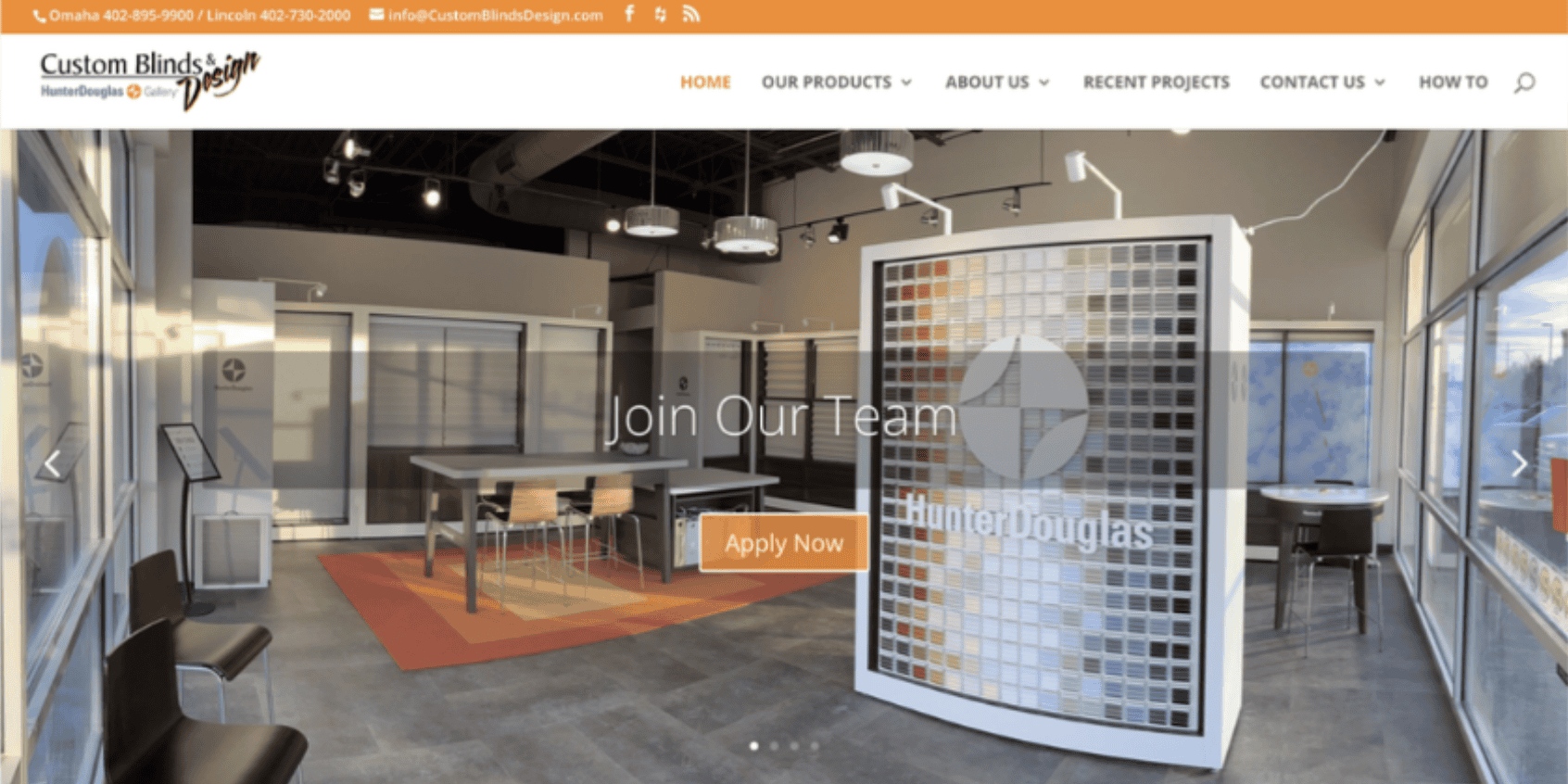
Before Custom Blinds & Design came to us, they struggled with this. How many customers do you think accidentally clicked “apply now” looking for a quote for their blinds?
A call to action is more than just a button or a link—it’s an invitation for your visitors to engage with your site. Whether it’s signing up for a newsletter, making a purchase, or scheduling a consultation, CTAs guide your visitors towards the actions you want them to take.
Here’s why they matter:

Directs User Behavior:
Clear and prominent CTAs help guide your visitors through your website, leading them towards meaningful interactions and conversions.
Enhances User Experience
When visitors know exactly what to do next, it reduces confusion and frustration, leading to a smoother, more satisfying user experience.
Boosts Conversion Rates
Well-placed and compelling CTAs can significantly increase the chances of visitors taking the desired action, thereby boosting your conversion rates.
After we got done with Custom Blinds & Design’s new hero header, it was clean and clear. Brilliant color, simple typography, clear copy.
Buttons done well are minimal and chic.

Characteristics of Effective CTAs
Not all CTAs are created equal. To be effective, your CTAs should be:
Clear and Direct
Use concise and action-oriented language. Phrases like “Get Started,” “Contact Us,” or “Download Now” are straightforward and effective.
See ARTILLERY’s site. You’ll never miss our “GET STARTED” button. No matter where you are on the site!

Visually Prominent
Ensure your CTAs stand out. Use contrasting colors, larger fonts, or bold buttons to make them noticeable.
For bonus points, add a soft glow to make it really “pop” off the screen like we did on practical marketing skills new site.

Strategically Placed
Position your CTAs where they make the most sense—at the end of a compelling section, in the sidebar, or even as a sticky element on the page.
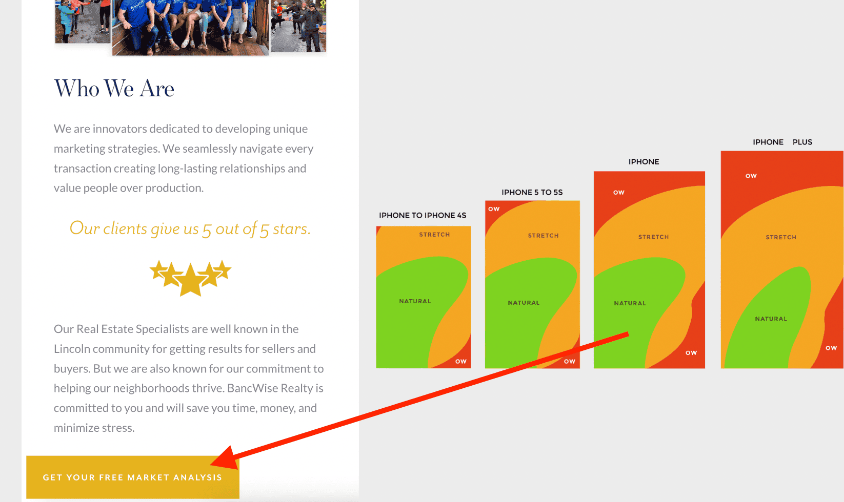
At BancWise.com, we made sure the CTA was near the thumb on mobile. Checkout this post for more info on this subject.
Relevant and Valuable
Your CTA should promise something of value to the visitor, whether it’s exclusive content, a special offer, or a helpful resource.
We still love the Bancwise.com home hero on desktop, too. The primary CTA remains clear and simple. While the secondary CTA, while more out of the way, still encourages us to keep exploring.

Examples of Effective CTAs
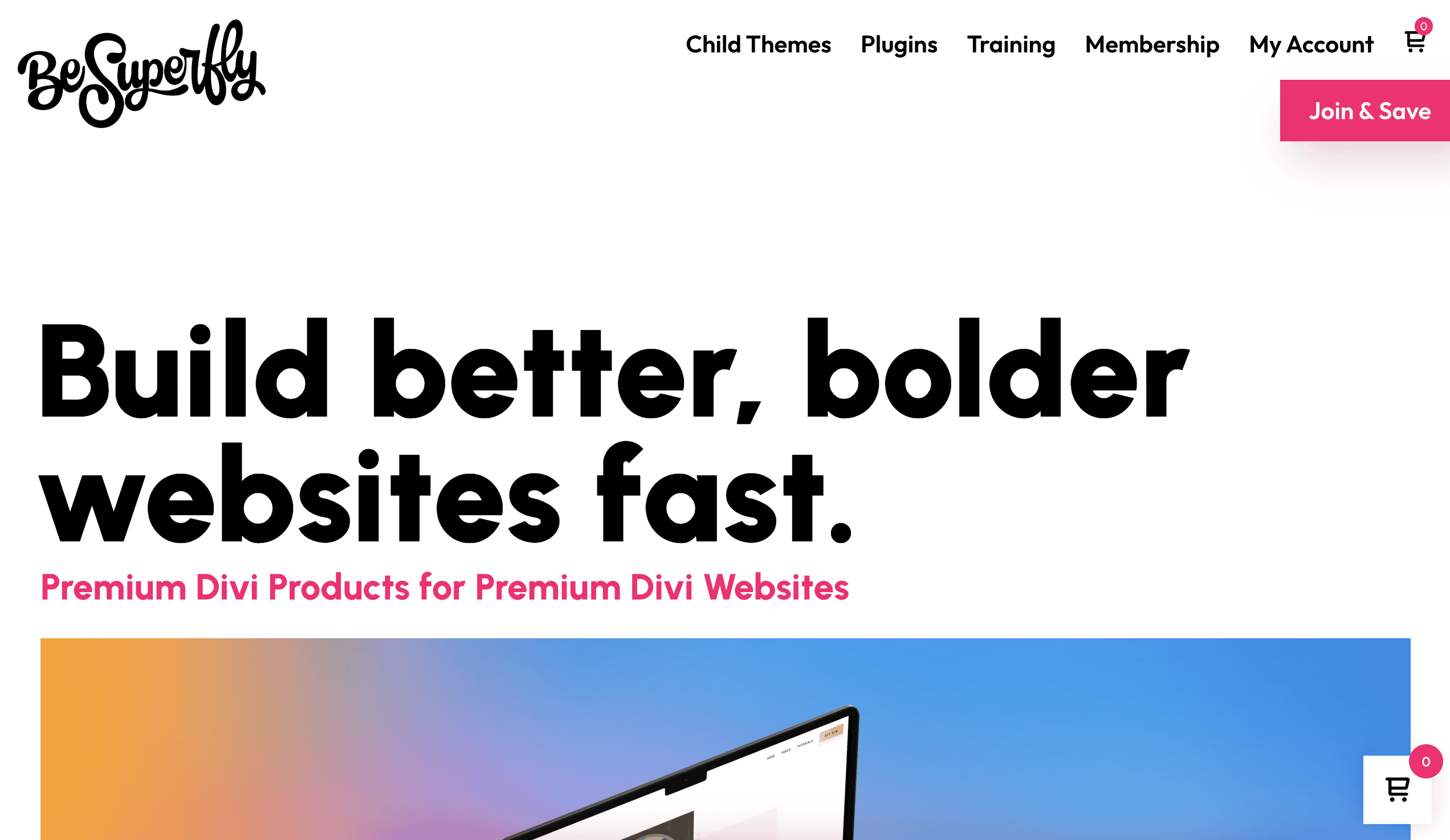
Checkout the size of this button and the hover effects on the BeSuperfly.com site:
Now take a look at the top of the site:
Best case scenario, have short offers in your CTA’s like: “Start Free Trial” (like Shopify. Clear, value-driven, and prominently placed above the fold.) or “Get Started Free” (like HubSpot. Emphasizes no cost and is accompanied by a strong visual design.) or “Join Free for 1 Month” (like MailChimp Marketing. Combines a compelling offer with immediate action, placed prominently on the homepage.)
The majority of small businesses, however, don’t have an offer like this available. They just want visitors to fill out the form! If that’s the case, that’s okay.
We can still use the right wording to make sure we don’t resort to “Learn More” for our button text 😆
Tips for Creating Your Own CTAs
Here are some actionable tips to create CTAs that convert:
- Use Strong Verbs: Words like “discover,” “learn,” “start,” and “get” encourage immediate action.
- Create Urgency: Phrases like “limited time offer” or “only a few spots left” can prompt visitors to act quickly.
- Make It Personal: Use first-person language like “Get My Free Guide” to make the CTA feel more personal and engaging.
- Test and Optimize: Continuously test different versions of your CTAs to see what works best. A/B testing can provide valuable insights into what resonates with your audience.
Incorporating obvious calls to action on your website is not just a best practice—it’s a necessity. By guiding your visitors towards meaningful interactions, you can enhance user experience, boost engagement, and drive conversions. Stay tuned for the next part of our series, where we’ll explore the importance of images of success and how to effectively show that on your website.
Ready to take your website to the next level? You know what to do.
Fill out the Form!
Call to Action
Want to learn more about optimizing your website? Keep up to date with every post. Subscribe to our newsletter for the latest tips and insights delivered straight to your inbox!
Note: Much of our website strategy is attributed to Building a StoryBrand by Donald Miller.