WholeheartedHealthcare
What She Wanted to Achieve:
- Create a unified, seamless user experience in one cohesive space
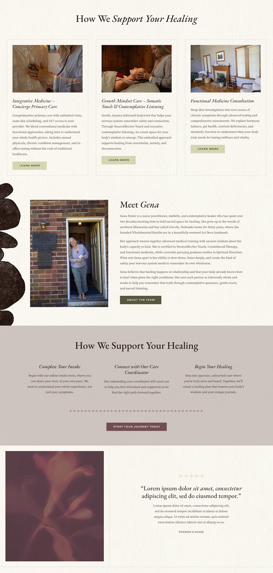
- Develop a modern design that reflects her holistic, contemporary approach
- Provide intuitive navigation that makes connecting effortless for patients
- Capture the warmth and authenticity of her in-person care online
The logodesign
The logomark is grounded and organic, with hand-drawn lines forming a nature-inspired symbol that conveys wholeness and renewal. The upward movement suggests growth and healing, while the balanced shape creates a sense of calm. It’s timeless and human, reflecting both holistic care and the healing journey.
Moredetails
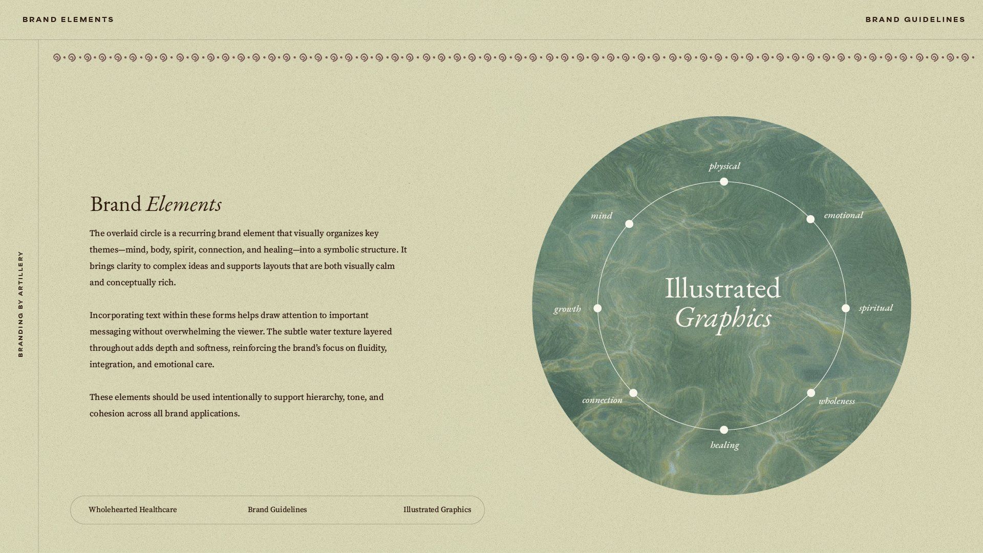
The visual identity feels warm and grounded, featuring organic, hand-drawn elements, subtle textures, and stone-inspired forms that echo restoration and balance. The logomark reinforces themes of growth and wholeness, while muted, nature-based colors and clean typography work together to create an atmosphere of calm professionalism. The result is a timeless, human-centered brand that authentically reflects holistic care.