Rise IntegrativeHealth
What She Wanted to Achieve:
- Create a meaningful logo mark with hidden symbolism that reflects healing, growth, and transformation
- Develop a brand identity that feels colorful, distinctive, and full of personality while remaining calm and approachable
- Incorporate organic elements and watercolor-inspired textures to create a natural, human-centered feel
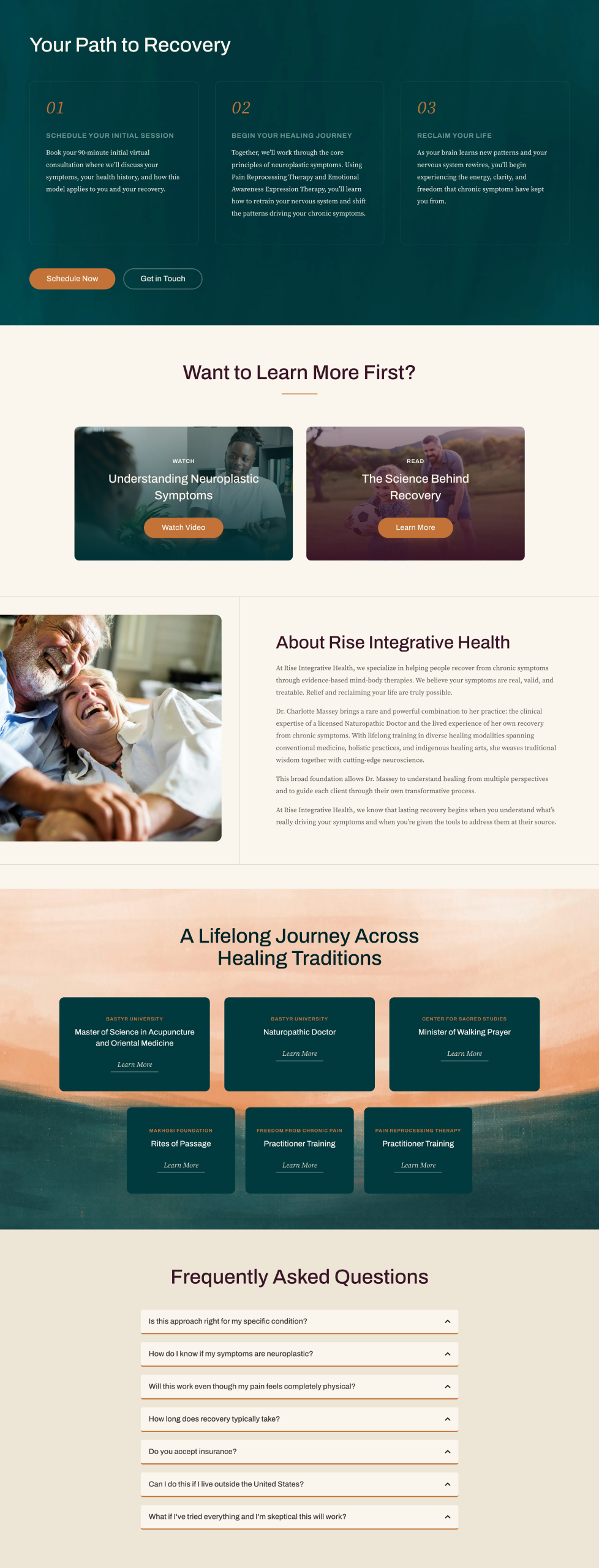
- Design a cohesive website experience that carries the same warmth, authenticity, and sense of renewal as the brand itself
The logodesign
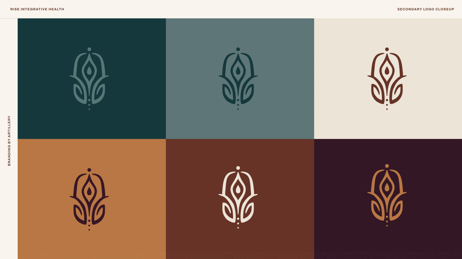
The Rise Integrative Health icon represents the journey from pain and limitation to healing, renewal, and restored vitality. Inspired by natural, organic forms, the design’s upward movement reflects growth and transformation, while the central teardrop symbolizes hope and renewal. Grounding elements at the base convey stability and resilience, capturing the practice’s holistic approach to helping individuals find lasting balance and wellness in body, mind, and spirit.
Moredetails
The Rise Integrative Health brand blends meaningful symbolism with a warm, organic aesthetic. Inspired by nature, the visual identity incorporates watercolor-inspired textures, calming colors, and a custom logo mark designed with layers of hidden meaning that represent healing, growth, and restoration. Paired with clean typography and thoughtful design details, the brand feels both vibrant and calming, creating a welcoming experience that reflects the practice’s holistic approach to care.